All works
Booking platform for multi-uses
Booking platform for multi-uses
Stopping users from running away
April - September 2017 | B2C product | Booking platform | Pre-product-market fit

Background of the project
After 1.5 year since its launch, ikky struggled to build a large user base and derive constant income from their booking services. They hired me as their first UXer to identify their business' issues, discover users' painpoints, and improve the usability and user experience of ikky's website and mobile app for generating more traffic and usage. The first phase focused on restaurant booking service as it was the most used service of ikky.
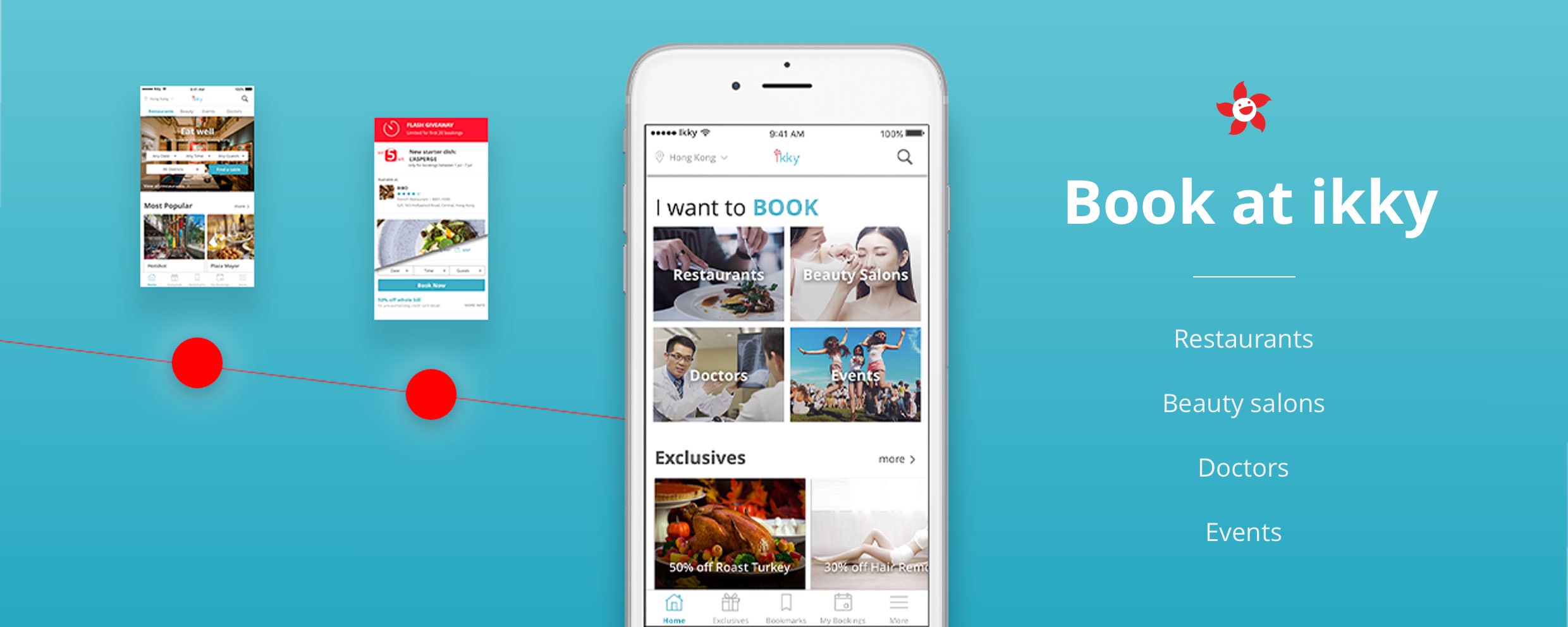
About ikky
The product I worked on | Who did I work for?
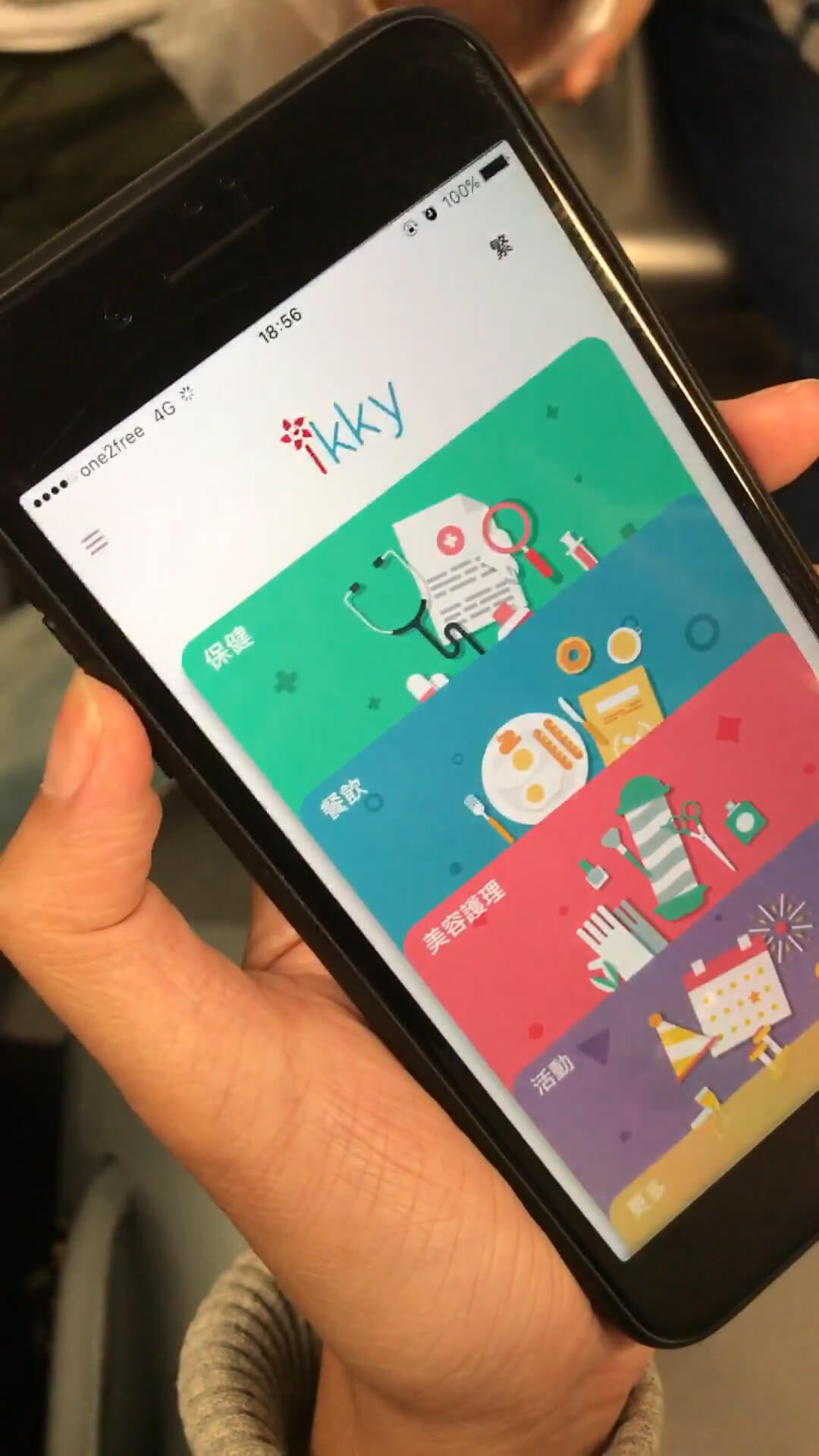
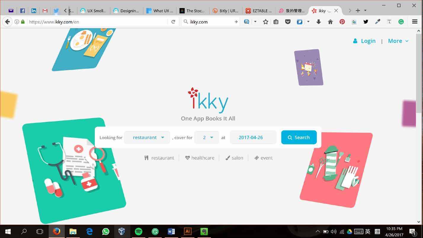
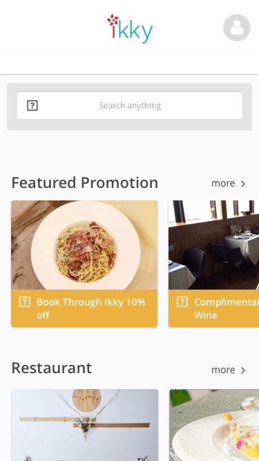
ikky is a booking platform that offers restaurant, beauty, medical and event booking services in Hong Kong. Sponsored by a restaurant group, the platform built the website and mobile app for consumers under the same name "ikky". It has also built a web app for managing bookings by staff of the service providers.
My role in this project
Lead UX designer
I was the UX lead mainly responsible for identifying the problem of the app and delivering a design solution for improving the app's traffic and usage. I was responsible for the user research, UX/UI design and timeline management for the project. In delivering the design solution, I worked with a UI designer, 2 iOS developers, 2 Android developers and 4 full stack developers.
How did I approch?
The first thing I did was asking for a budget to run user testings.
With the budget approved, I proceeded to recruit users spreading a survey via social media. The survey helped to identify users who liked to book restaurants and were willing to do user testing.
8 users were selected for user testing from 134 respondents from the survey.
Recruited users were asked to use ikky’s app to perform the tasks of searching a restaurant and making a booking for their next dinner date.
The result pointed out critical problems that deterred users from using ikky for booking.
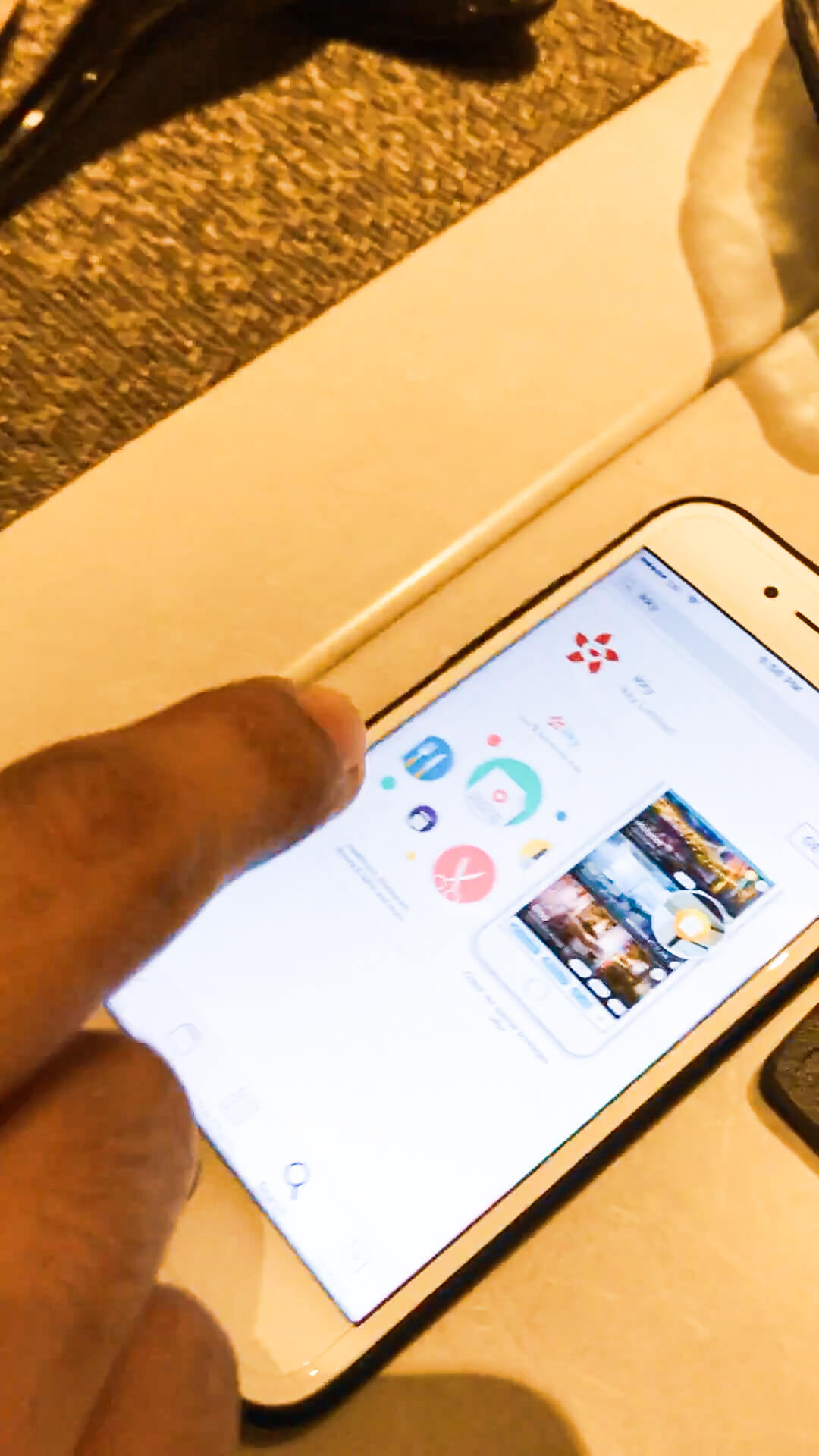
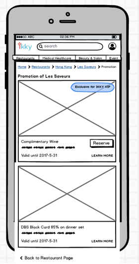
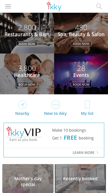
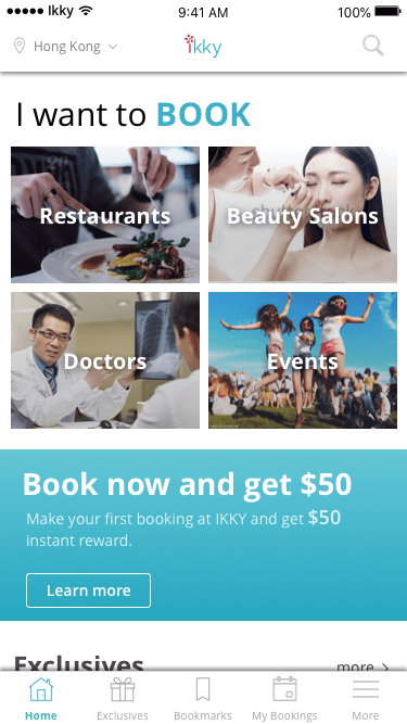
Above was the homepage of ikky. According to the result from user testing, users found were often lost when they landed on this page as they could not find any clues what the website was about. In a nutshell, the experience offered was not what users expected.
What were ikky’s critical problems?
According to GA data, 52.9% of the users left immediately after they reached the landing and only 2.13% of the users made a booking at the end. The user testing revealed that users found ikky’s website and app too childish and unprofessional. They also had difficulty navigating to find a suitable restaurant to make a booking.
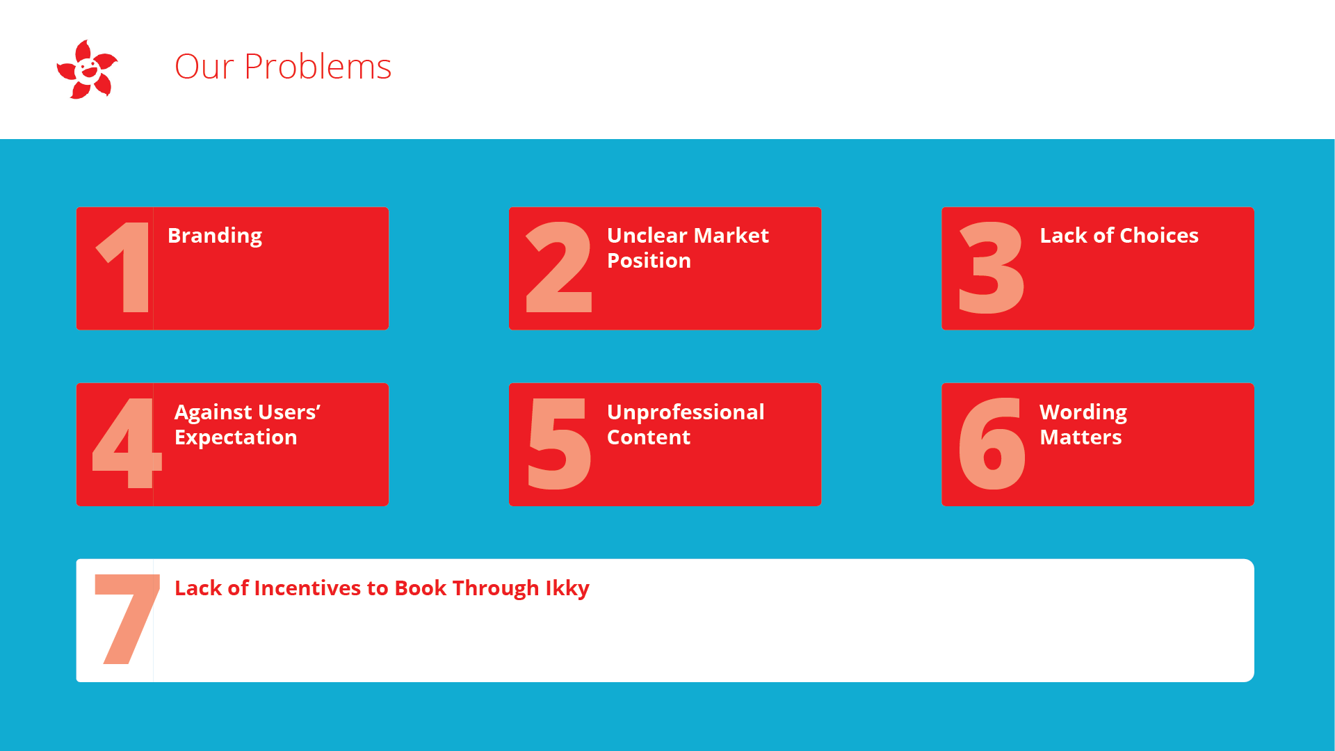
After presenting the findings to the management, we decided to focus on making sure that ikky fulfilled most users’ expectations.
To dig deeper into why ikky failed to meet users’ expectations, I conducted a flow analysis on the three main use cases based on GA data and user testing findings.
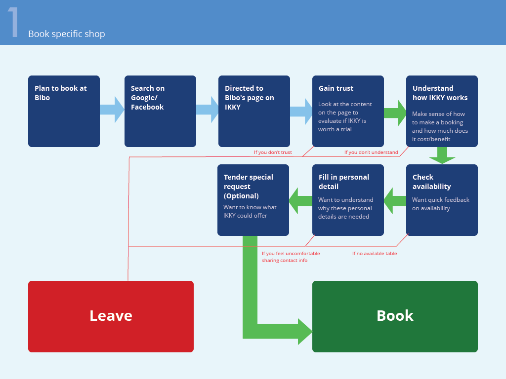
Use case 1’s flow chart
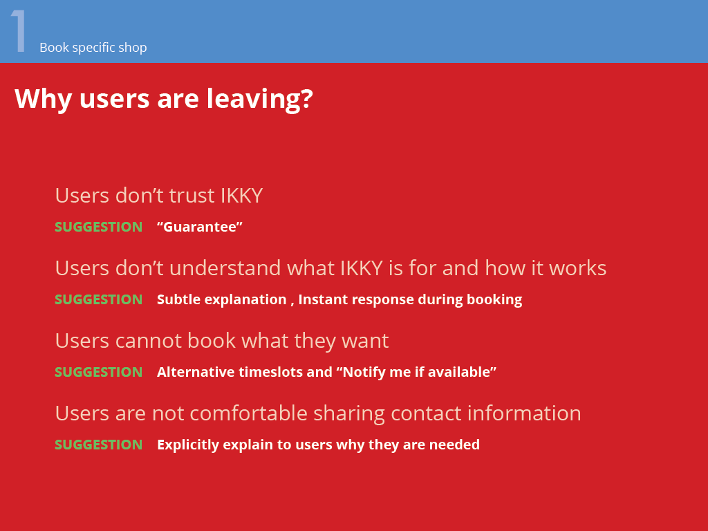
Use case 1’s problem analysis. This analysis summarizes the leave reasons as indicated in red arrow in the flow chart.
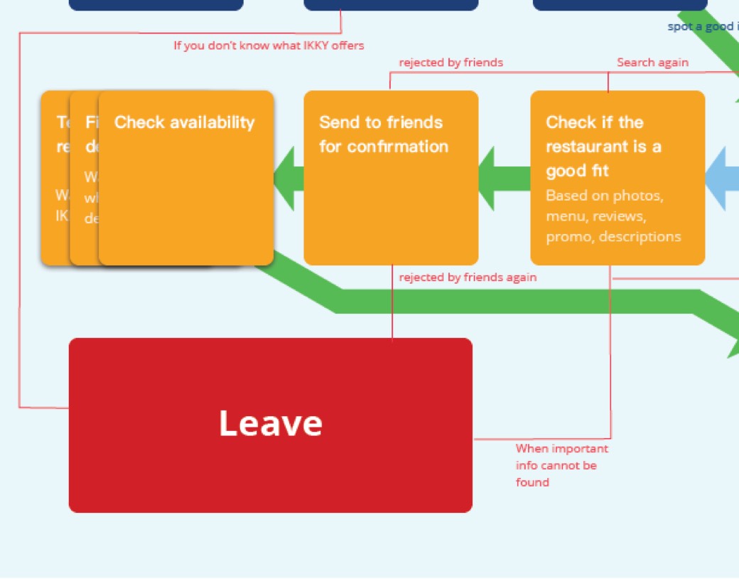
The flow analysis helped visualize the reasons for users to drop off from ikky in the following three main use cases:
- Book a specific shop
(as directed from search engine) - Browse for a suitable shop to book
- Search for a specific shop to book
Interested in reading more about the three use cases and their specific problems?
Read full flow analysis
Flow analysis
Flow analysis is a very powerful tool to help you identify hurdles at every step of a use case that had stopped users from proceeding. The beauty of applying this method is that you immediately identify action items at each single step of your design to help converting.
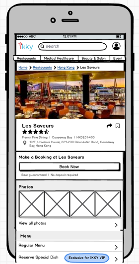
Prototype created with Balsamiq
A low-fi clickable prototype was crafted with Balsamiq to quickly test how the identified issues could be fixed.
What stopped users from booking?
Land on ikky
they stopped because of
“What the xxxx is ikky?”
This was the typical response when users landed on ikky’s homepage or detail page.
Suggested solution
Suggested solution
Communicate ikky’s offering in global navigation
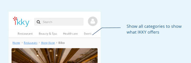
By putting the service categories in the global navigation, users would immediately be aware of what ikky offered, in whatever use cases.
Back
Search a restaurant
they stopped because of
Irrelevant and misleading search results
The limited listing of restaurants offered often made the users disappointed whether they searched by keywords or filters.
Suggested solution
Suggested solution
Promote browsing, suppress searching
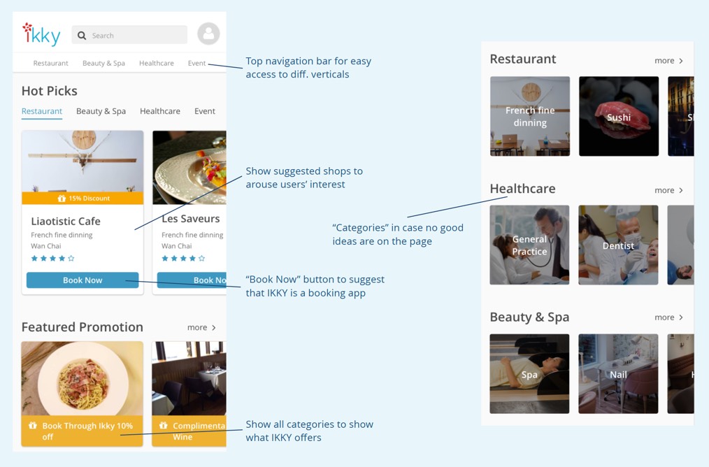
Given the inadequate resources to acquire partners and content, suppressing searching could effectively reduce irrelevant search results. Idea suggestion was needed to promote browsing instead of searching.
Back
Make a booking
they stopped because of
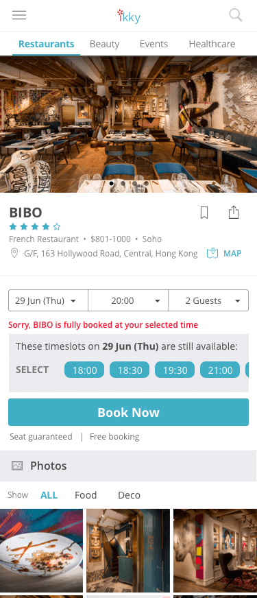
Timeslots were unavailable
As users landed on the restaurant’s detail page, they felt miserable as many of the restaurants didn’t return any available timeslots after search.
Suggested solution
Suggested solution
Alternative timeslot suggestion
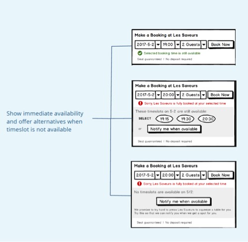
Alternative timeslots would pop when the selected timeslot was unavailable to reduce occasions of disappointment.
Back
Management were unconvinced that they should suppress searching. To solve this disagreement, I worked with the UI designer to create two prototypes for testing.
Version 1
Version 1 minimized the search function to a rather small icon on the right top corner. The design invited users to browse the lists curated.
Version 2
Version 2 started with a full width search bar that invited users to search anything.
Each prototype was presented to 5 different users for testing. The main idea was to observe how users would find a restaurant for booking. In version 1, none of the users used the search function. While in version 2, 3 out of 5 clicked the search bar to proceed. This demonstrated that minimizing the search function could divert users from jumping to searching to browsing the suggested content.
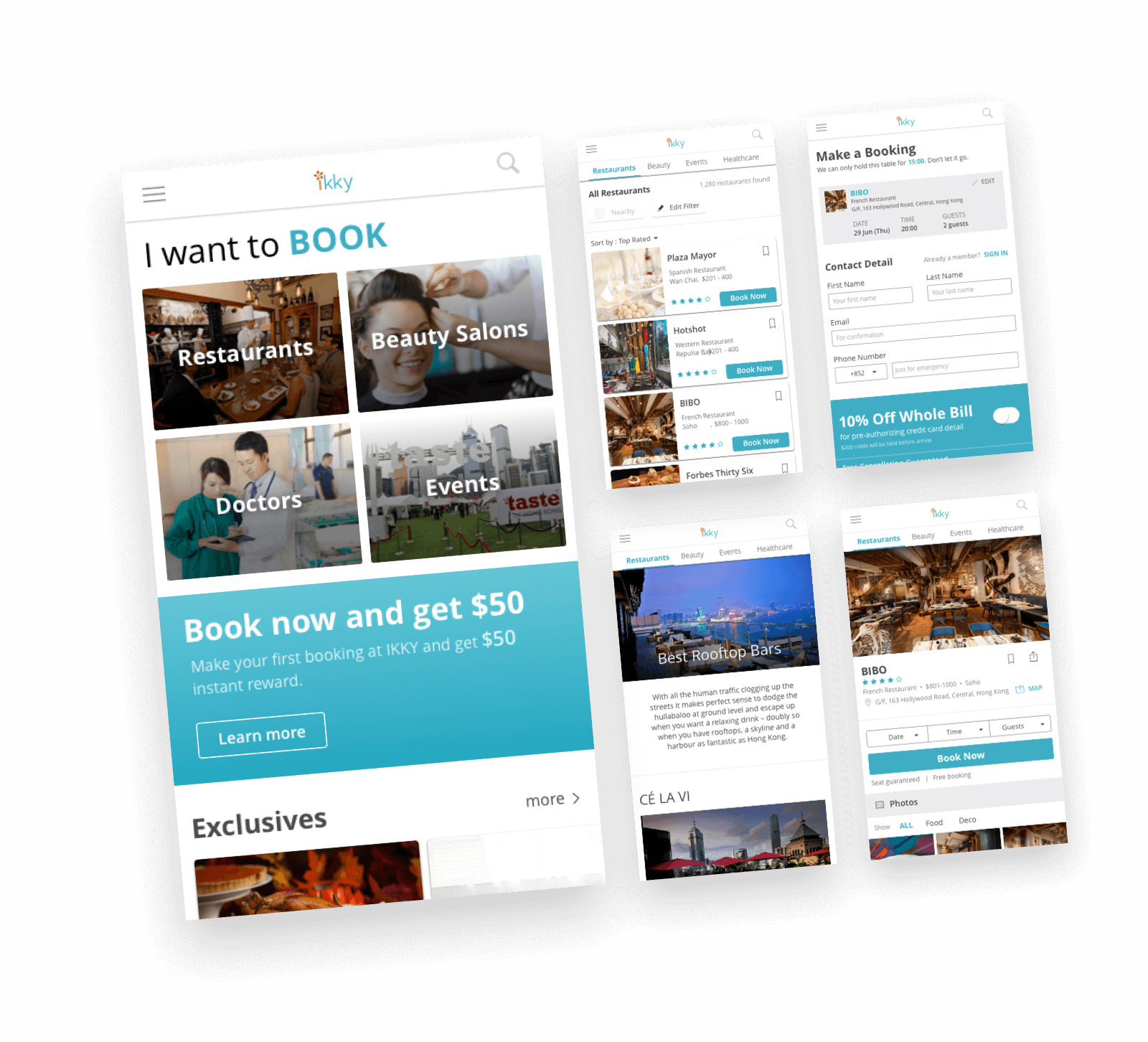
The feedbacks from user testing supported my early thought. Based on the feedbacks, a hi-fi mockup was finally confirmed and shipped for development.
How to get buy-in from management?
Getting buy-ins is a constant struggle for designers. While working in ikky, I often came into disagreement with the management. When I encountered these situations, one thing I did was to offer design alternatives. By assessing the pros and cons of each options with data, it becomes much easier for the management to visualize the impact.
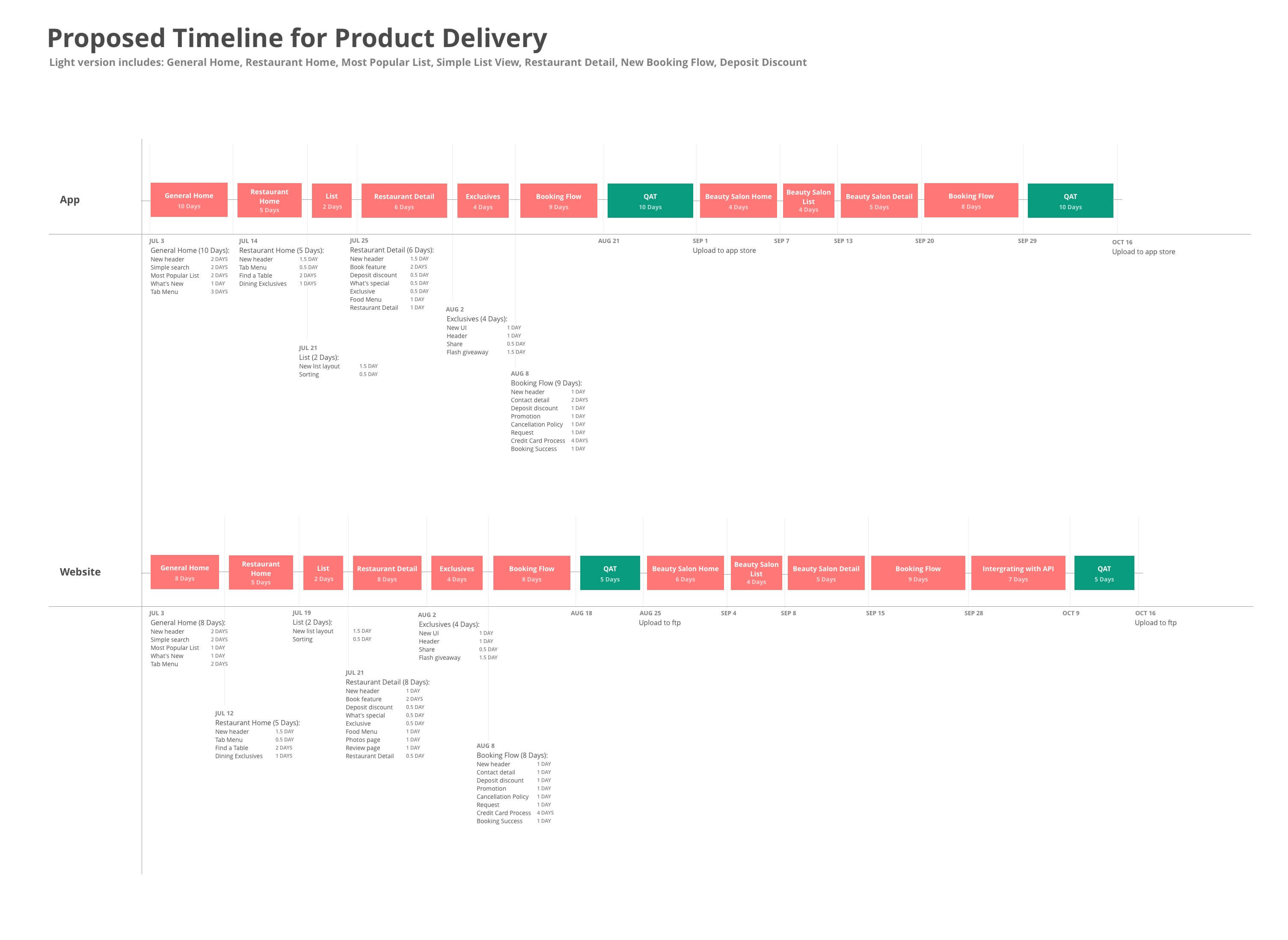
To make sure the new version launch as scheduled, something unexpected was assigned to me.
Working closely with the development team and the marketing team, I tried to make sure that the development of the website and the app would be shipped as scheduled.
The outcome
The new version of the website was finally launched in August. The iOS and the Android apps followed in September and October.
This video was made from the promotional materials for ikky iOS app.
A key strategy of the new version was to turn the app to a guide (instead as a directory).
Acknowledging the issue of irrelevant search result, a new direction of ikky was to turn itself into a guide by providing suggestions in the form of lists, articles and stories. On top of diverting the users from searching, this direction could help create content to be searched on Google or for spreading on social media.
To help facilitate this change, I worked out a content creation guide to assist the marketing team and the account management team to provide relevant content.
The new version fixed the issue of broken booking journeys by alternative timeslot suggestion.
This helped halve the timeslot error rate as there was a much reduced chance for not returning any available timeslot when users make a booking.
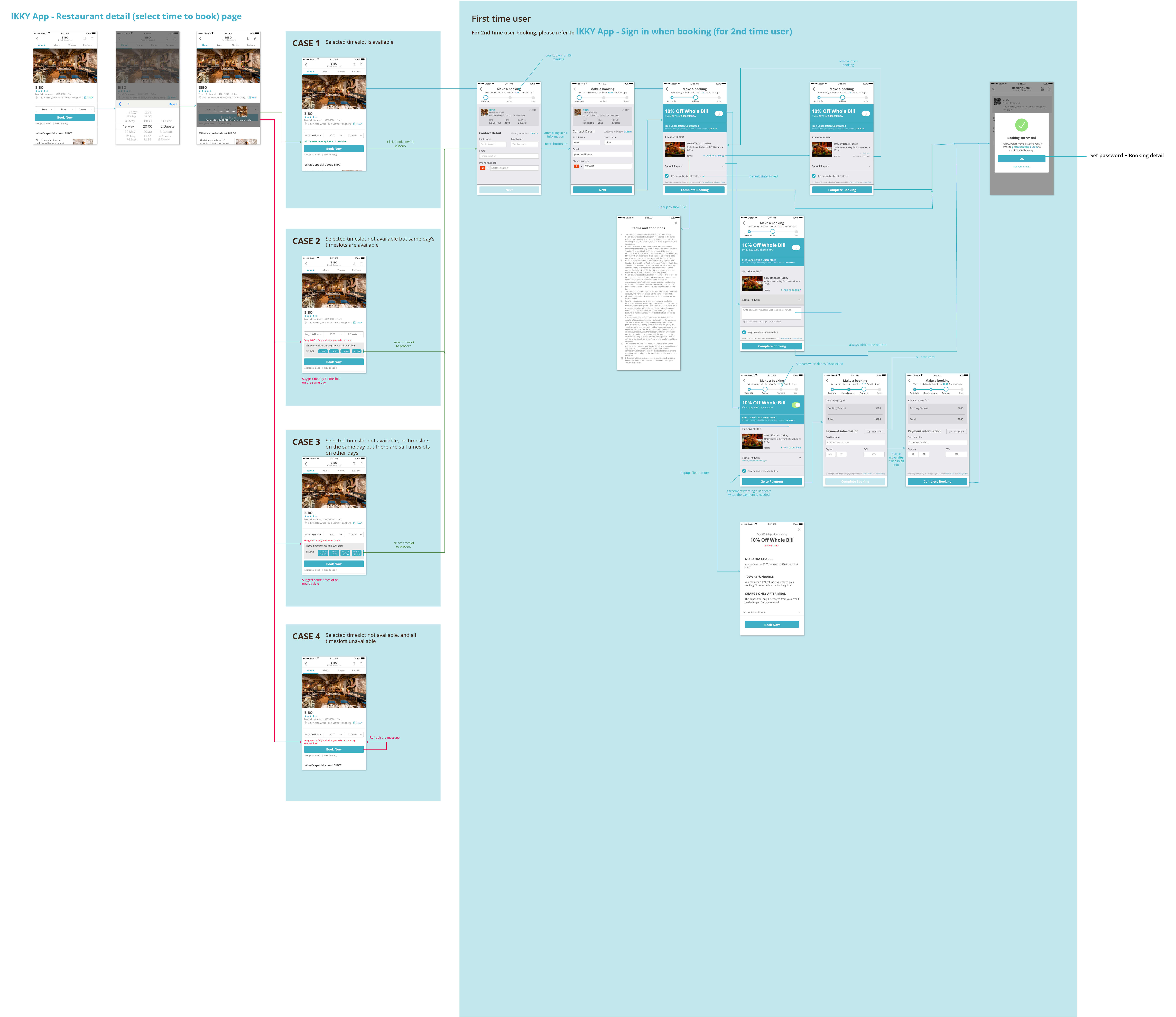
This wireframe was used to communicate with developers how the different cases should be handled if the selected timeslot was unavailable.
What’s next?
While the restaurant section was being developed, I went on to start working on the beauty booking service, which was eventually launched in December later that year.
If you want to learn more about how did I approach the design for ikky’s beauty booking service, feel free to contact me for a walkthrough.
If you want to learn more about how did I approach the design for ikky’s beauty booking service, feel free to contact me for a walkthrough.
Update on April 20, 2020
ikky ceased its operation in 2019 (2 years after I left) due to insufficient funds. For this reason, their website and app are disfunct and could not be accessed at the moment.