All works
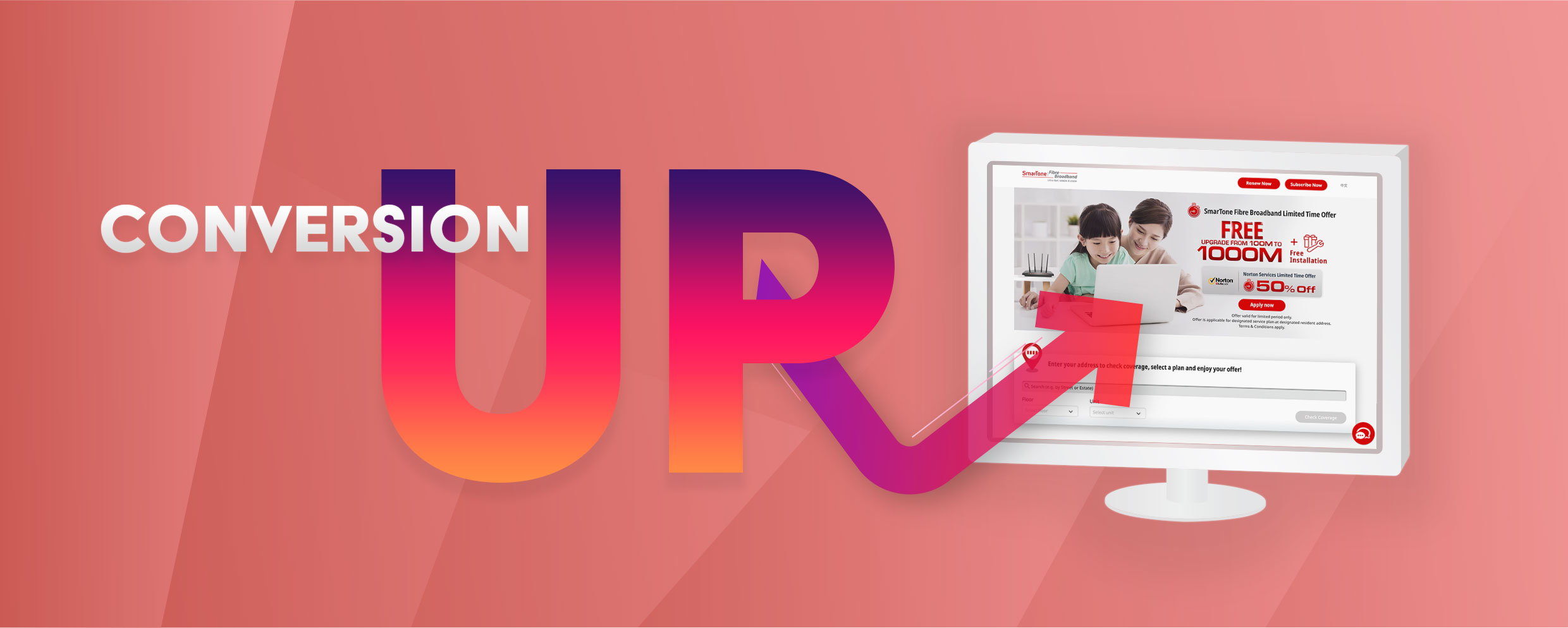
Boosting broadband service conversion
Boosting broadband service conversion
Designing to help online subscription convert
May - December 2019 | E-commerce | Product growth

Background of the project
The conversion rate of SmarTone’s home broadband service through online channel had been dwindling at 2%. One of the key goals of our department in 2019 was to increase the conversion rate of broadband service’s online subscription. With this in mind, I was delegated to lead the design initiative.
About SmarTone Online Store
The product I worked on
SmarTone Online Store is a SmarTone's online channel for subscription of mobile tariff plans, home broadband services and other services. It also sells mobile phones and gadgets.

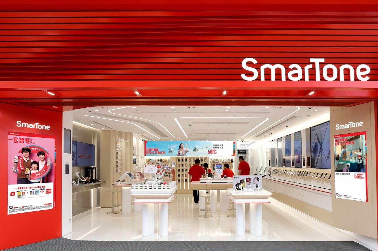
About SmarTone
Who did I work for?
SmarTone is a leading telecommunications company in Hong Kong. SmarTone offers mobile tariff plans, home broadband, landlines and other related services. I was hired as Senior UX designer by SmarTone from 2018 to 2020, focusing on improving the conversion rates of SmarTone’s Online Store as well as online service subscription.
My role in this project
Project lead
I was the project lead assigned to tackle the conversion issue. Bringing in my experience in experiment and A/B testing, I proposed a framework for experiment to the product owner. Upon acceptance, I acquired the access to online store's Google analytics for further analysis. Hypotheses derived were presented with mockups for discussion with the product owner and developers. Approved designs and set-ups were then sent for development where I was responsible for overseeing the quality assurance and conversion funnel monitoring.
How did I approch?
I began by analyzing the conversion funnel for broadband subscription.
Plan selection (62.5%) and personal information (90.1%) were the two steps that most people dropped off.

Conversion funnel of SmarTone’s broadband services (29 April - 12 May, 2019)

Plan selection page (as at 29 April 2019)

Personal information page (as at 29 April 2019)
I thus started making hypothesis to explain why users left from these pages. I chose the personal information page to start with.
Why hypothesis prediction?
Qualitative data could tell you what things happened but not why things happened. To reveal the reasons behind users’ drop-offs, qualitative research methods should be adopted.
However, due to budget constraint, SmarTone could not sponsor incentives for users to participate in user interviews. For this reason, I turned to hypothesis prediction and testing to try to seek the answer.
However, due to budget constraint, SmarTone could not sponsor incentives for users to participate in user interviews. For this reason, I turned to hypothesis prediction and testing to try to seek the answer.
Two attempts had been made to reduce the drop-offs at the personal information page.
Attempt 1
Launched on 13 June 2019
Hypothesis
Progressive disclosure could encourage more users to go through the one-time password (OTP) verification to proceed.
Rationale of the hypothesis
As I went on to track the data for the events of going through the OTP verification, I found that only 18.7% of the users had clicked “Get the Verification Code” while the rest 81.3% did not proceed. I suspected that users’ attention were not drawn to the button.
What did I propose?
Original design
New design

By hiding the form elements other than the OTP verification action, the new design attempted to focus the users' attention on going through the verification.
The result
Conversion rate
No change
Both the “Get the Verification Code” event click rate and the conversion rate at this page did not change.
Attempt 2
Launched on 6 September 2019
Hypothesis
Removing the the one-time password (OTP) verification could reduce the drop-offs at the personal information page.
Rationale of the hypothesis
As most users left before running the OTP verification, removing the process could encourage users to proceed.
What did I propose?
Original design

New design

The new design did not require users to go through the OTP verification, i.e. entering the code they receive from their phone number to continue the form filling.
The result
Conversion rate
Slightly decrease
The conversion rate dropped from 2.37% to 2.25% after the launch.
We therefore came to the conclusion that OTP verification was not a significant factor affecting users’ drop-offs at the personal information page.
Why did we stop here?
There were more things we could try such as changing the one-page form into a multi-page one, auto-fill and the like. However, these all required too much development effort so our team decided that they were not worth testing.
I turned to the plan selection page to make further attempts.
Attempt 3
Launched on 5 November 2019
Hypothesis
Adding visual indicators could help users differentiate between the plans, reducing drop-offs at the plan selection page.
Rationale of the hypothesis

Flow analysis revealed that about 60% of the users at the personal information page went back to the plan selection page. A wild guess discussed within our team was that the plan cards looked too similar so the users needed to go back and forth to look for differentiators.
What did I propose?
Original design
New design

A banner was added to each plan so that users could 1. differentiate the plans with the visual; 2. relate the visual to the ad banners.
The result
Conversion rate
Increase
The drop-off rate at the plan selection page decreased from 62.5% to 59.8% and the overall conversion increased from 2.22% to 2.5%.
Though attempt 3 delivered a positive result, our team were still looking for more improvement.
Attempt 4
Launched on 19 November 2019
Hypothesis
Reducing the choices available could help users to select a plan more easily.
Rationale of the hypothesis
Despite the plans look more differentiated after adding the banners, feedbacks from colleagues suggested that the page still looked messy. Information overload were likely to happen when users landed on the page.
What did I propose?
Original design
New design

The number of recommended plans was limited to 2 plans at maximum. It was expected that the limitation of choices would help users make a decision.
The result
Conversion rate
Increase
The drop-off rate at the plan selection page further decreased to 58.4% and the overall conversion rate reached 3.02% in the 2 weeks after the launch.
The outcome
Conversion rate of SmarTone’s broadband service subscription reached
3.02%
+ 0.65%
(From May 2019 to December 2019)
This end result exceeded the set goal of 2.6% and presented a 27.4% percentage increase.
What’s next?
The success story of using hypothesis testing to improve the conversion of SmarTone’s broadband service was hoped to be copied to SmarTone’s other services. This initiated my team’s effort to start adopting the same method for key mobile tariff plans and roaming services. It was hoped that by deriving hypotheses for testing, the conversion rates for other services could also go up in the future.